Role:
- Design
- SEO
- Content Management
- Web Development
Tools:
- Figma
- AI
- Adobe Suite
- WordPress
- HubSpot
Duration:
- Sep 2023 – Nov 2024
Impact
Website visitor per month
over 1000
Engagement connections
80%
Website bounce rate
40%
Web Design & Development
SEO Blog

Online Rental System

Career Portal

Homepage Redesign
1. Confusing Wordings With Cart And Quote
In the conventional meaning, the icon of a shopping cart means checkout. I can see the intention is to submit a sales quote but it confuses the users, especially the first-time users. Apart from that, I also found out there are separate shopping carts for equipment rental and sales. I think there can be a clearer classification on the header.
2. Missing Call To Action On The Header
As I studied different websites of competitors, most of them have a CTA (Call to action) button on top of their header. The CTA is the primary action you want your users to perform after they enter your website. In this case, perhaps you want to include a primary action, such as renting equipment or creating an account.
3. Confusing Information Architecture
Information architecture focuses on the organization and structure of content and navigation to improve user understanding and engagement. To optimize information navigation, I suggest refining the header by adding and removing certain items.
4. Hero Section Visibility
The hero section is often the first thing consumers see when they visit a website. It is critical to capture their attention, communicate important information, and direct them further into the site or business. In this case, the initial Call to Action directs users to ‘discover ANT advantages,’ leading them to a text-heavy page. This strategy may not be appropriate for effectively engaging people. Overlaying text on photos can also cause visibility issues.
5. Weird Use Of White Space
The weird use of white space refers to its ineffective utilization within a user interface. Instead of improving clarity and readability, it might interfere with how users absorb information and disregard design principles such as alignment and balance. I noticed a strange gap between text and image placement in the promotional area, which deviated from the alignment seen in other portions of the homepage.
6. Misplacement Of Creating An Account
I would suggest placing the user login button within the website’s header. This positioning ensures visibility, and efficiency, establishes a clear hierarchy, assures mobile responsiveness, and corresponds with user expectations. Such an approach reduces the extra scroll, resulting in a more seamless and user-friendly experience.


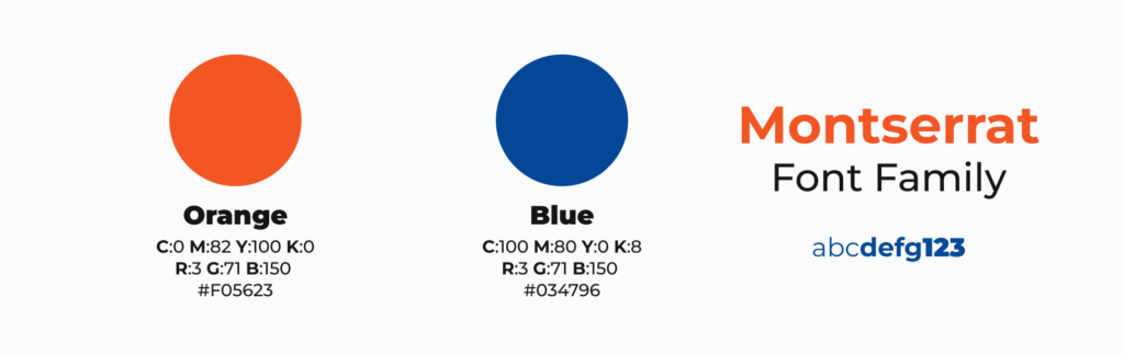
Branding
Logo
Colors & Font Family
Social Media

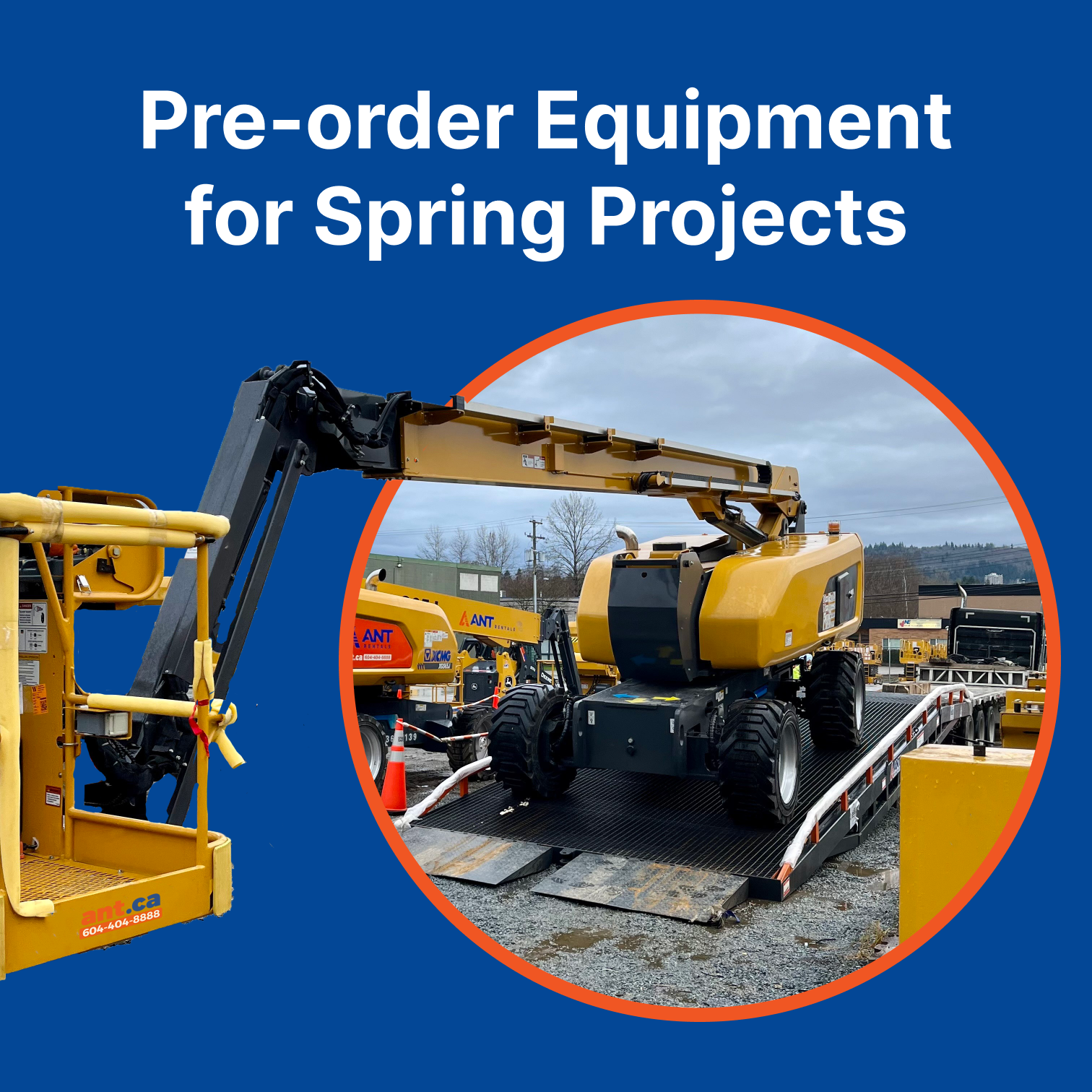

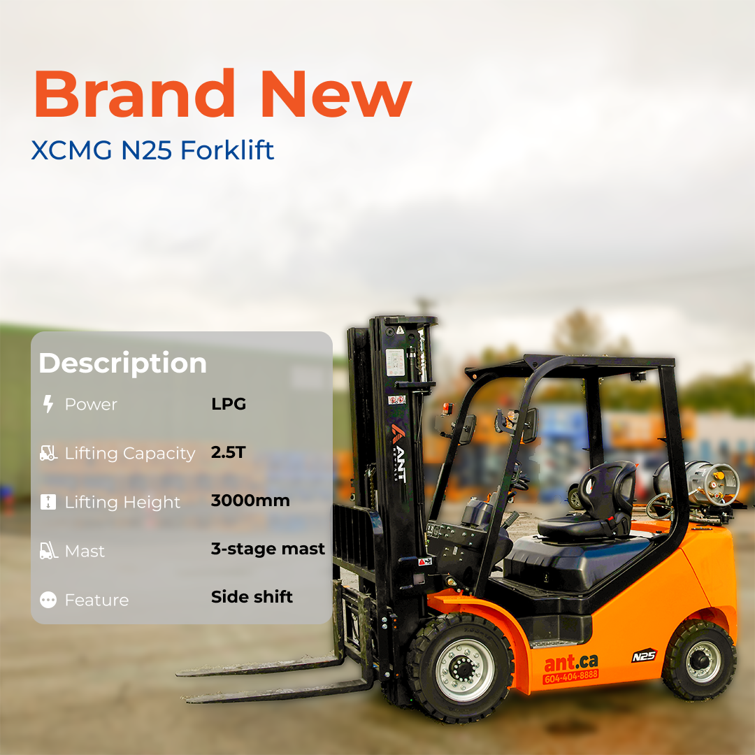


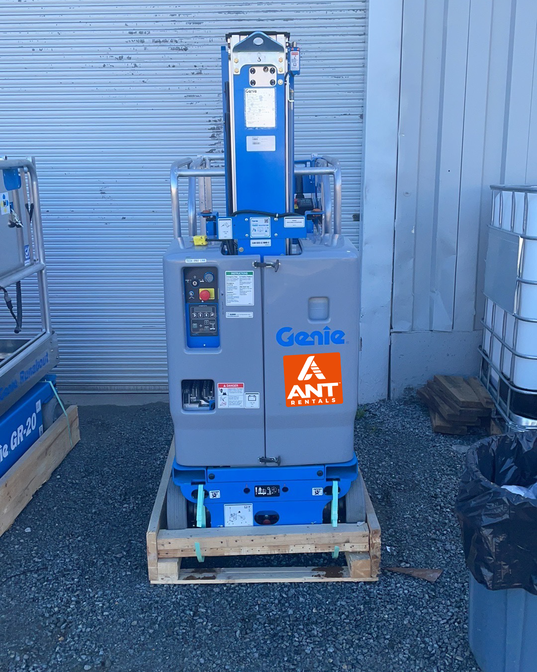
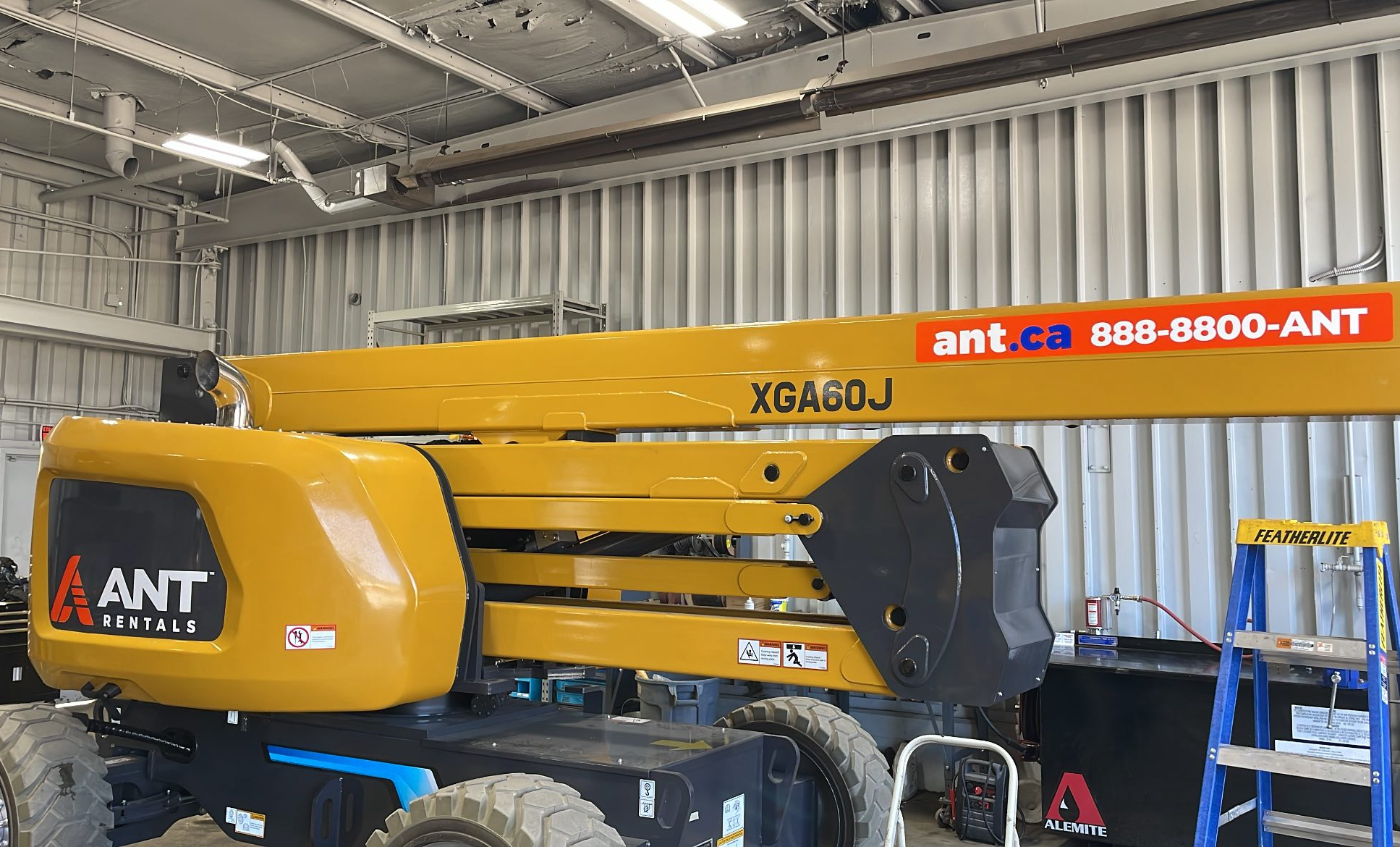
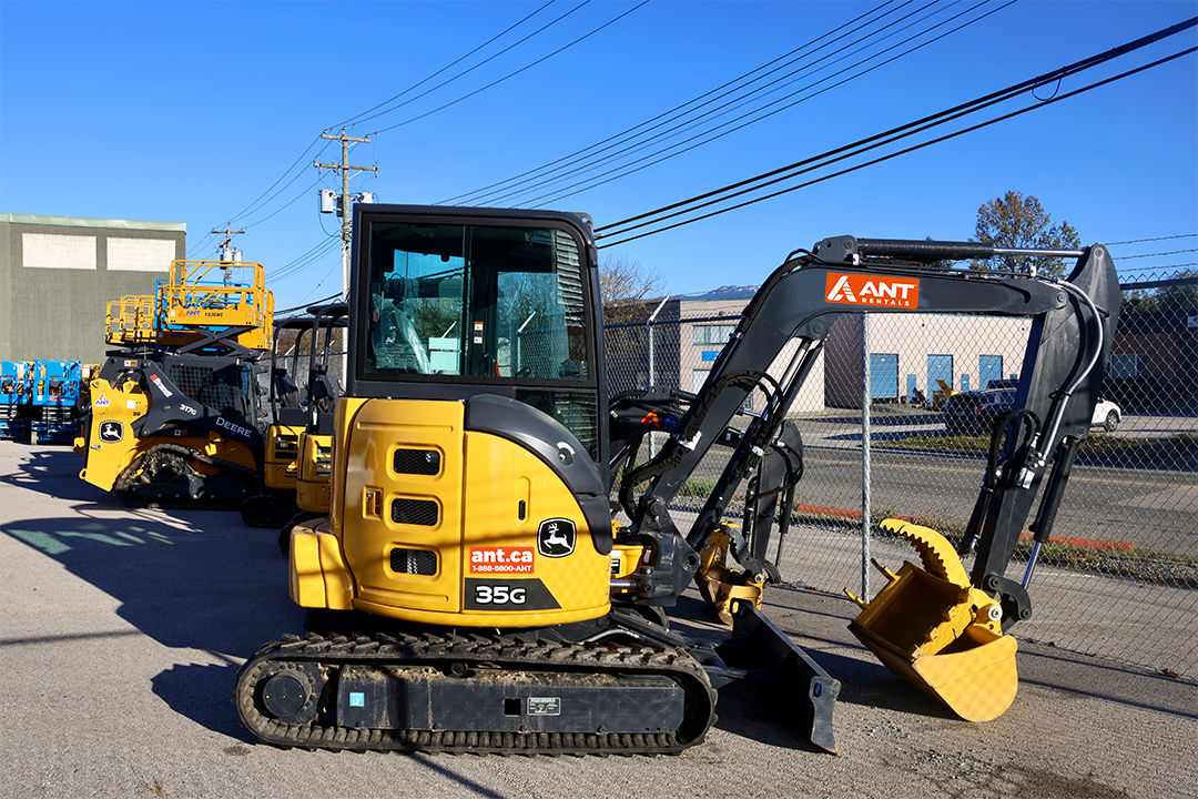
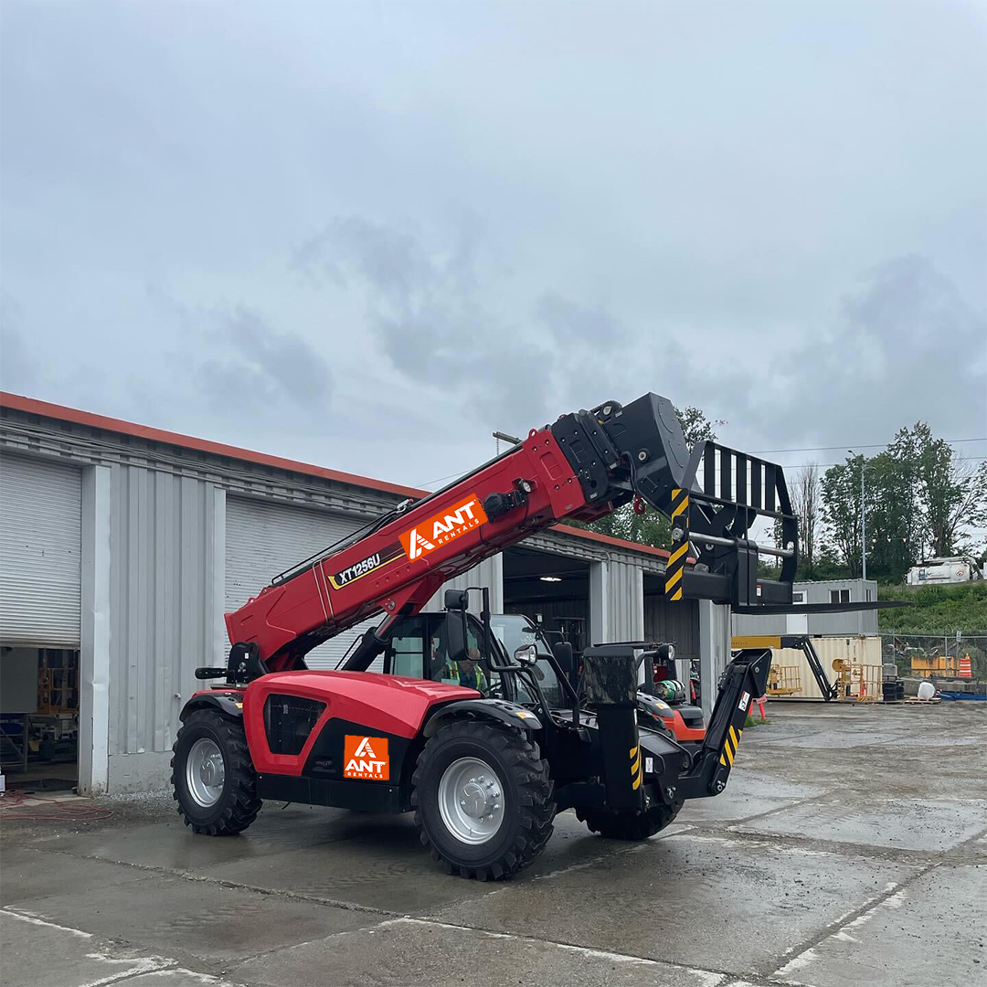
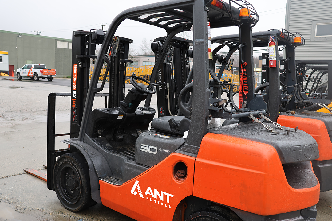
ANT Equipment Graphics (Application)


Delta Controls
5 mins read

CrowdEase
8 mins read

Rosemary
6 mins read