

Role:
- Research
- Project Management
- Design
- Development
Tools:
- Figma
- Grok3
- WordPress
- VS Code
Duration:
- Planning & Research: 7 weeks
- Ideate & Design: 5 weeks
- Develop & Testing: 8 weeks

Overview
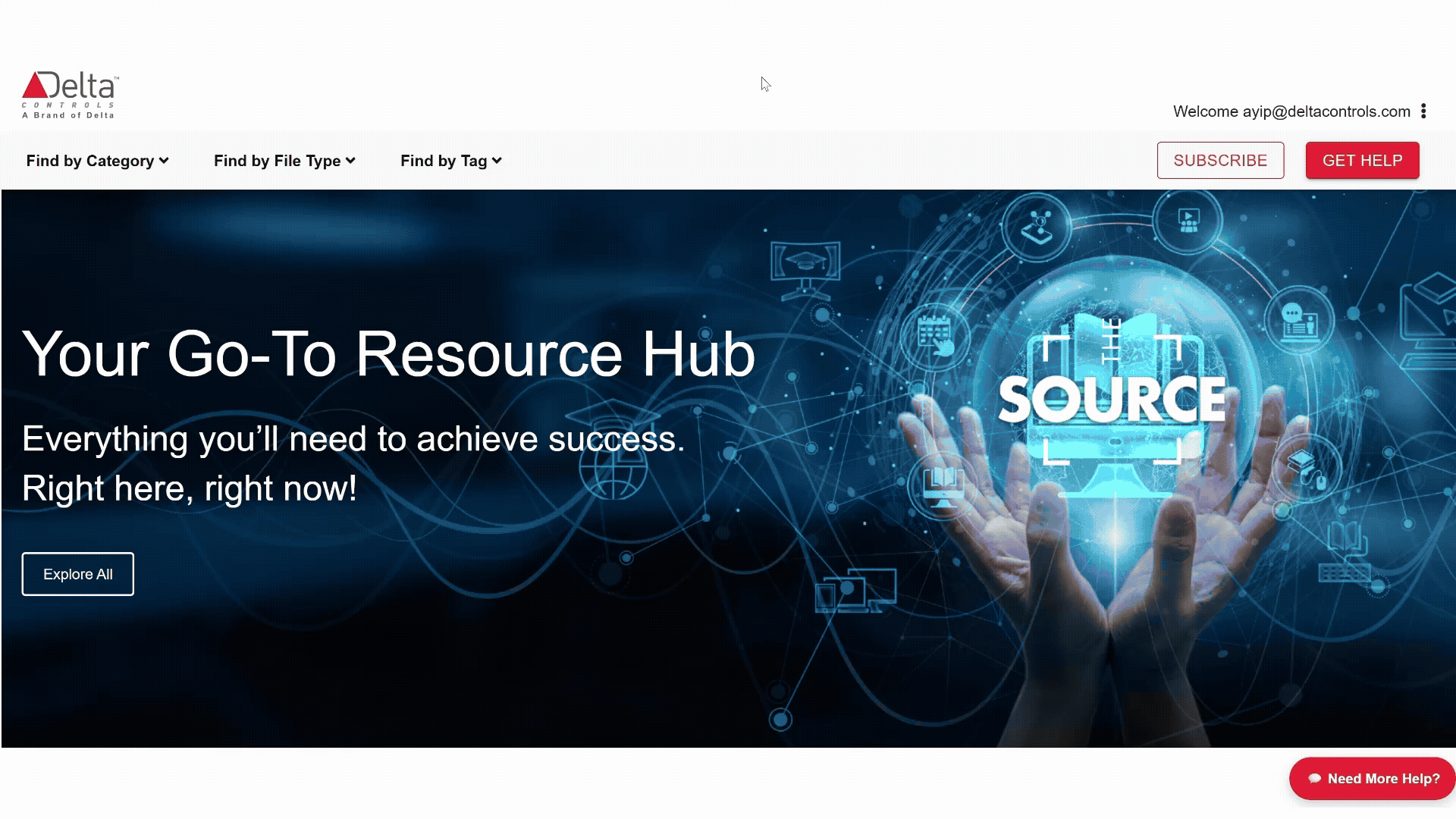
The Source is a digital library dedicated to providing non-technical documents, training, and marketing materials to Delta Controls’ partners and employees. This project aimed to rebuild the entire platform for a more intuitive and fluent user experience.
Impact
Average click to access information
2–3 clicks
Download conversion rate
22.5%
Engagement rate
15%
Problem
Users couldn’t navigate and search effectively.
The current design has the following core problems:
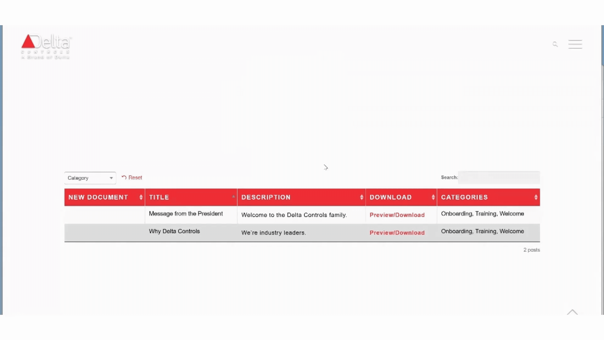
- Unclear Navigation to Access Information Users averaged 4–6 clicks to locate necessary files, which wasted a significant amount of time and reduced productivity.
- Ineffective Search 70% of users relied on search capabilities, but results were ineffective due to WordPress preset index constraints.
- Unorganized Category & Layout Tags are all over the place, and users expect more logical layouts.
Solution
A powerful yet user-friendly resource hub. Based on our understanding of our users, we deliver a modern and optimized Source 2.0 and the improvements include:
Streamlined Access Through a Centralized Resource Hub
Create a clear navigation system that is consistent with the company’s design system. Simplified navigation reduces clicks to 3-4, ensuring faster information retrieval.
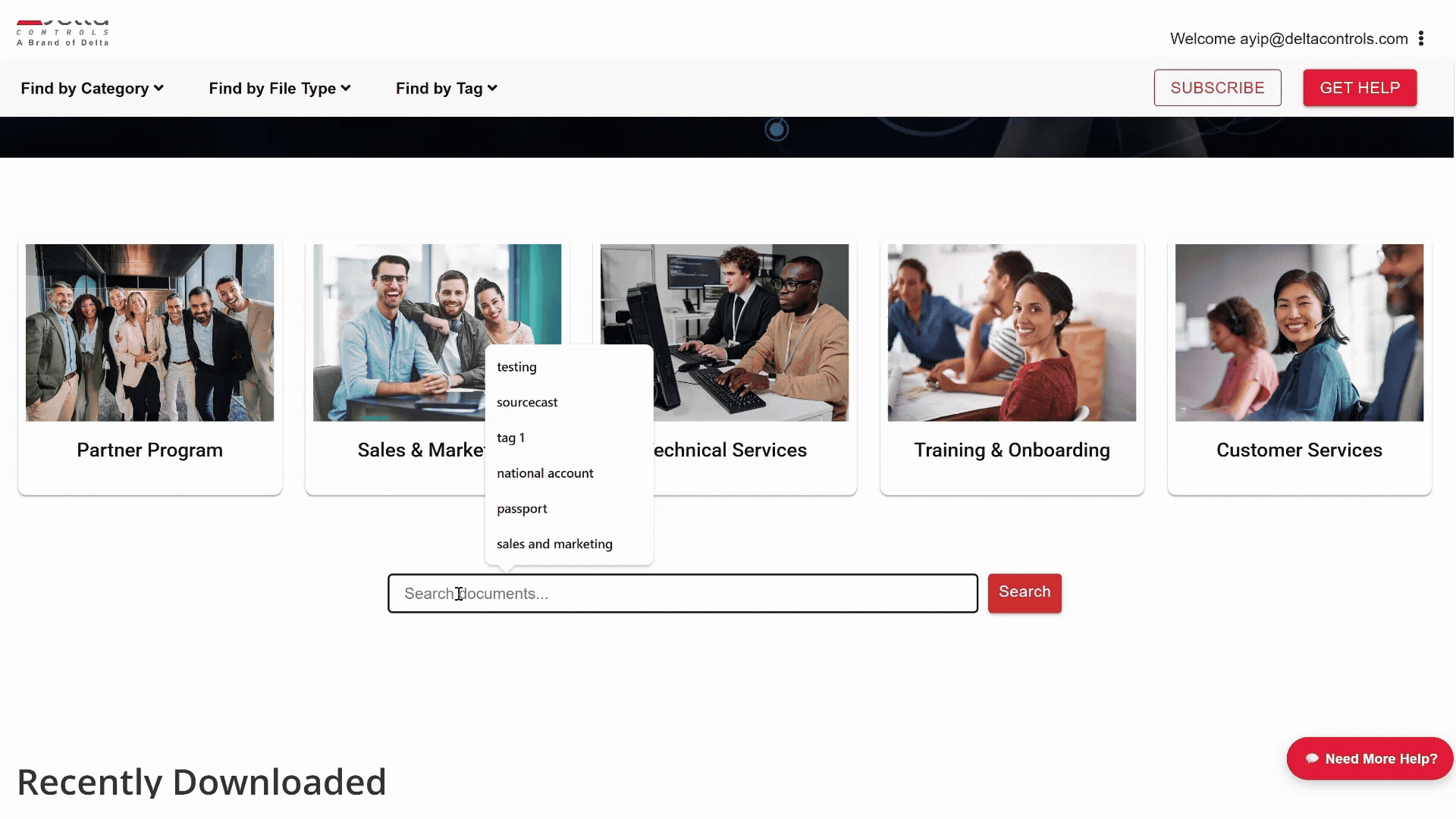
Enhanced Discoverability with Smart Search
The Source will use unified smart search, which will allow all documents, categories, and tags to be searched. Users can fill out a feedback form to notify the marketing staff of any missing content.
A Modern, Personalized
Resource Experience
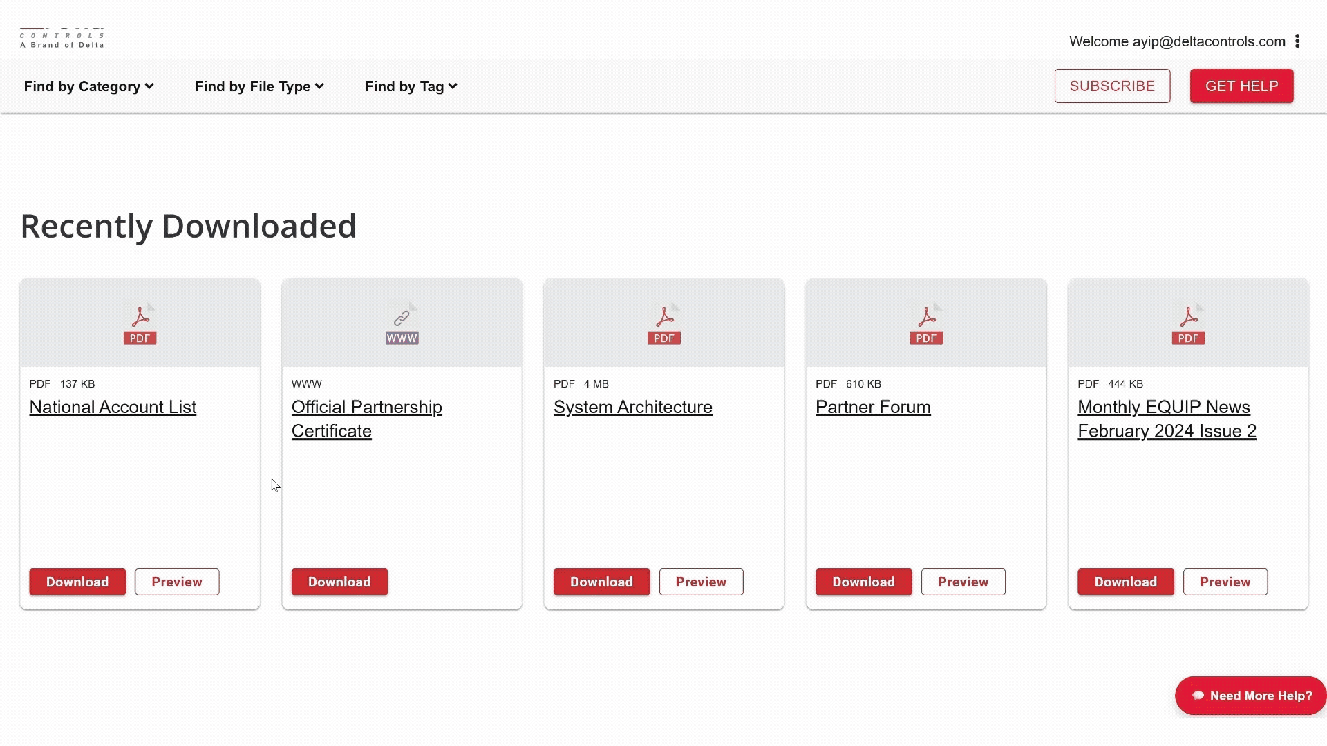
Our modern logical layout enhances customization, featuring recent and most-downloaded documents for quick access. Ensuring an efficient user experience tailored to your needs.
Research
Quantitative Research
Survey Methodology:
- Email invitation distribution
- Global reach: USA, Canada, Europe, Asia
- Cross-functional participants (e.g. sales, technical, support)
- Anonymous response collection

Insights
43% Low Usage Frequency
Nearly half of users access the platform less than once per month
3/5 Low Satisfaction
The average satisfaction score shows tremendous opportunity for improvement.
69% Excessive Clicking
Users require 4-6+ clicks to access needed information
Personas
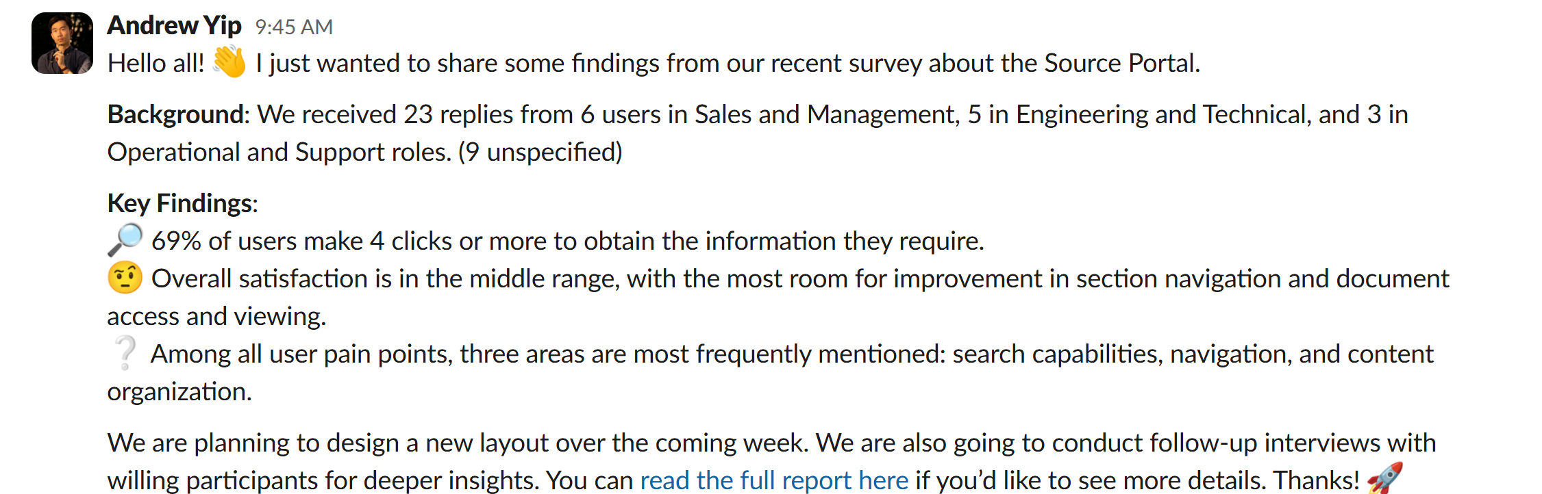
We had 23 participants who are all potential users of the Source. From there, we developed personas with specific pain points.


Qualitative Research
At the end of the questionnaire, we asked if anyone was interested in a follow-up interview, and five participants provided their contact info, but only two were interviewed. Special thanks to Cassandra from the UX department who took notes while I asked questions.

“If they tell to search it at the Source, they basically tell you to go Fxxk yourself”
James Ferdon, Business Development Manager
“You need to be really familiar with the platform to understand you can get everything from the Index”
Tim Arion, Sales Director
User Journey Map
Based on in-depth interviews with actual users, we were able to identify key spots where they experience major pain points.

Ideate & Design
Information Architecture
The IA explains why the previous version couldn’t perform an effective search and how the new one addresses the issue.


User Flow
We don’t want the flow to be stopped abruptly because users couldn’t find their document. That’s why we included a support button that connects user directly to the marketing team.

Wireframes & Prototype
We presented this prototype to the Marketing and Sales teams and received good feedback.
Takeaway
Addressing Technical Limitations and Stakeholder Pushback
The IS (Information Systems) team refused to connect the partner database directly to the communication channel while we are creating the subscribe function. This integration was primarily designed to pre-fill user personal information for a more seamless subscription experience. Our workaround required utilizing a built-in connector within the subscription form and adding an additional step for users to manually enter their information. It may not be ideal for user experience, but this highlights the significance of compromise and flexibility in meeting key user needs while considering time and cost.

CrowdEase
8 mins read

Rosemary
6 mins read

Ant Rentals
3 mins read