Role:
- Research
- Design
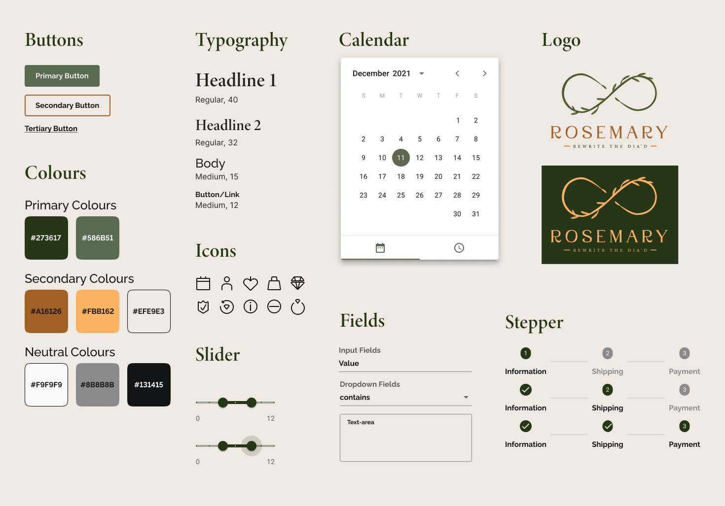
Tools:
- Figma
- Adobe Suite
Duration:
- Planning & Research: 8 weeks
- Ideate & Design: 4 weeks
Highlight
Collaboration
2 stakeholders & 1 developer
Front-end development
Material UI Library
Overview
Rosemary is a dynamic diamond brand targeting women aged 30-50. By offering lab-grown diamonds, customization, and transparent pricing, it caters to those valuing value over brand.
Challenge
How can a new brand gain consumer trust?
The overarching goals of this project is to:
- Increase the sales: convert the online traffic to make a purchase or book an appointment and visit the actual store.
- Build up Trust: optimize the user experience so customers know the brand is trustworthy
- Retain Customers: utilize the acquisition funnel, make clients come back next time and spread the reputation.
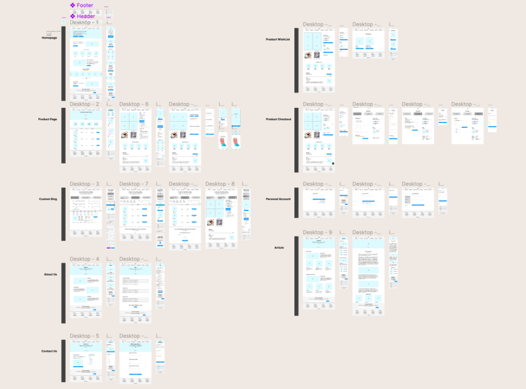
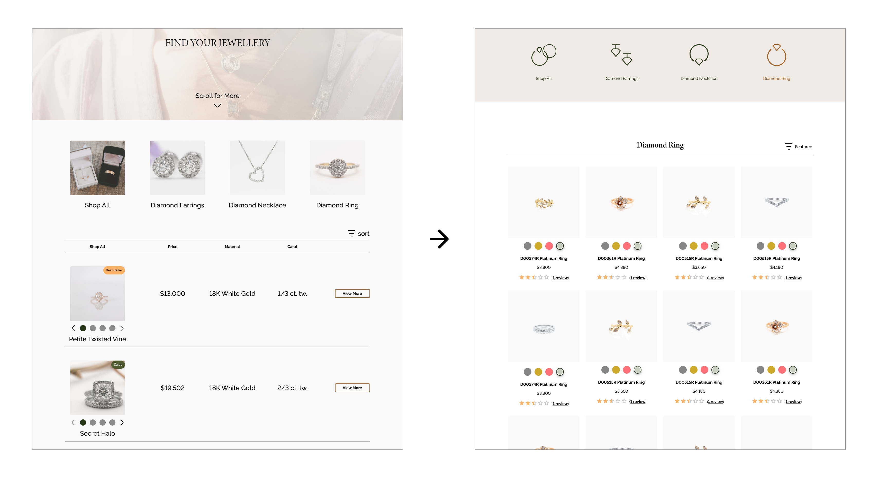
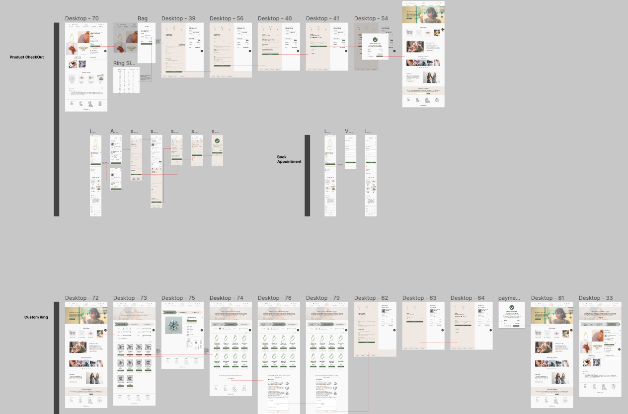
Key Features
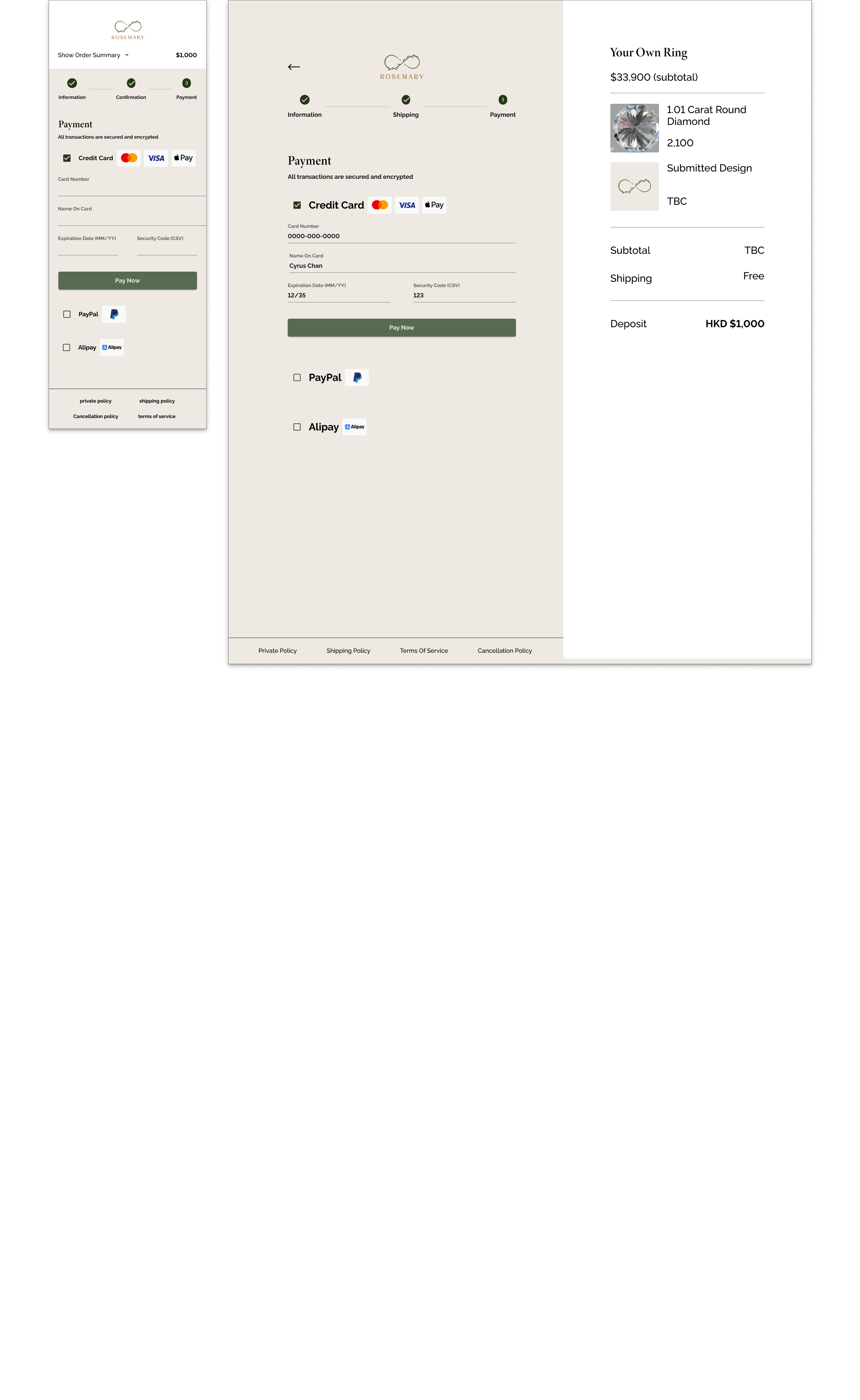
Aside from the basic checkout and booking appointments functionality, I explored with stakeholders and the developer several potential features that would set Rosemary apart from other E-commerce websites.
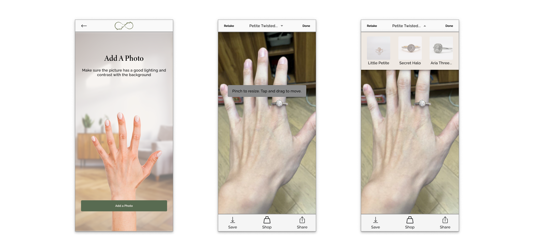
1. Virtual Try On
Allow users to virtually try on jewelry using camera feature. By overlaying the selected product on images of their hand, customers can visualize how items look before purchasing, enhancing the online shopping experience with a tangible preview.
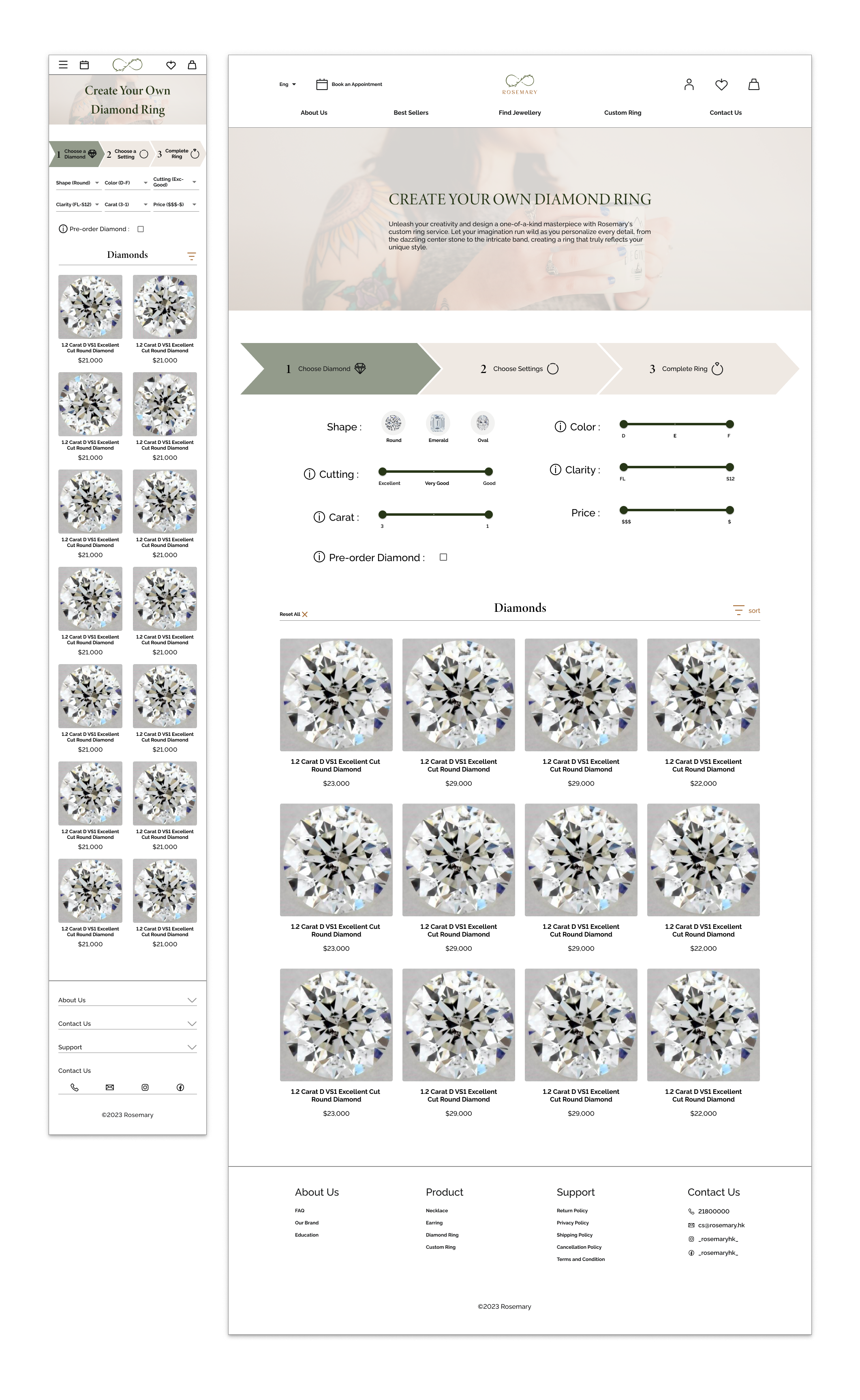
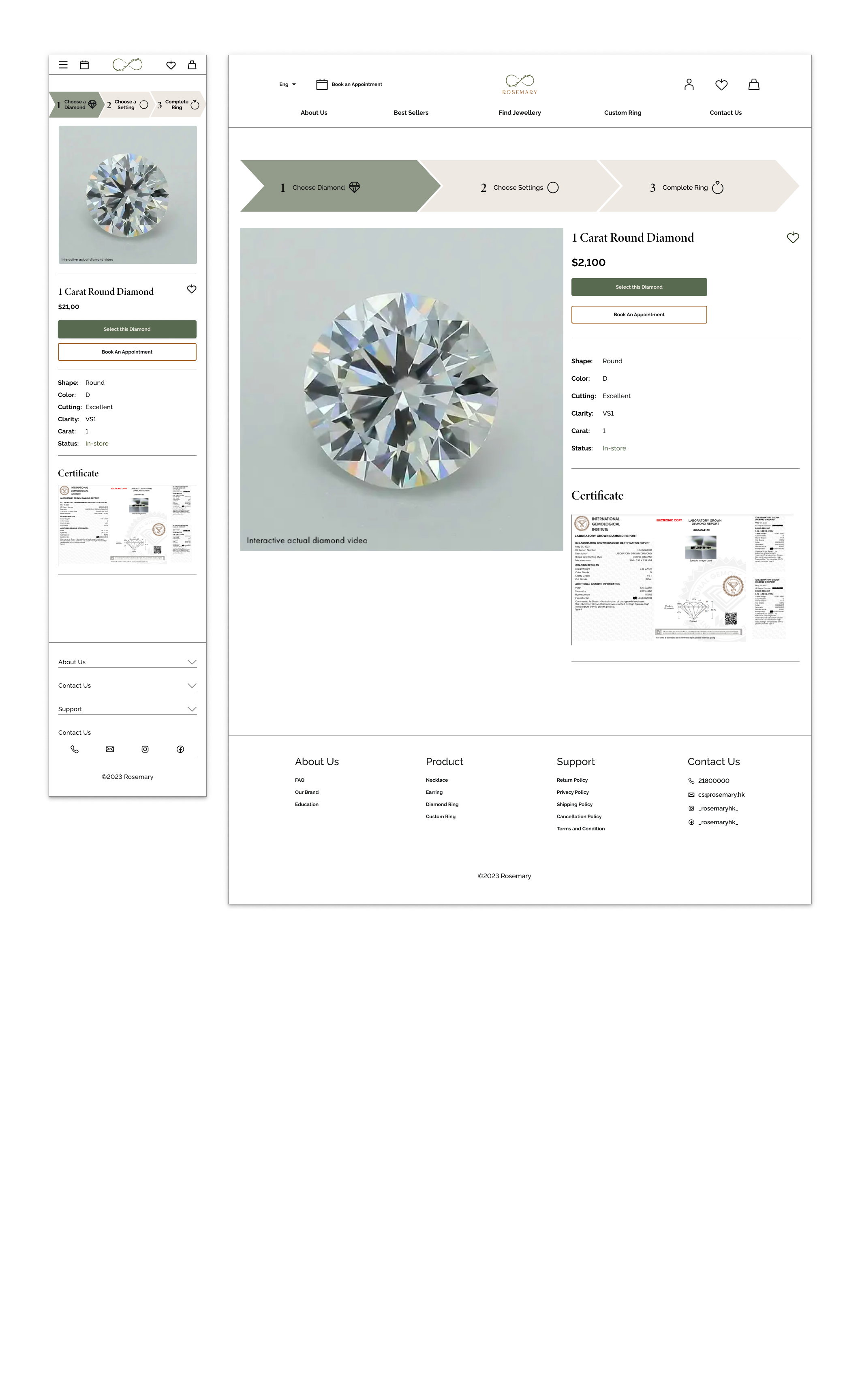
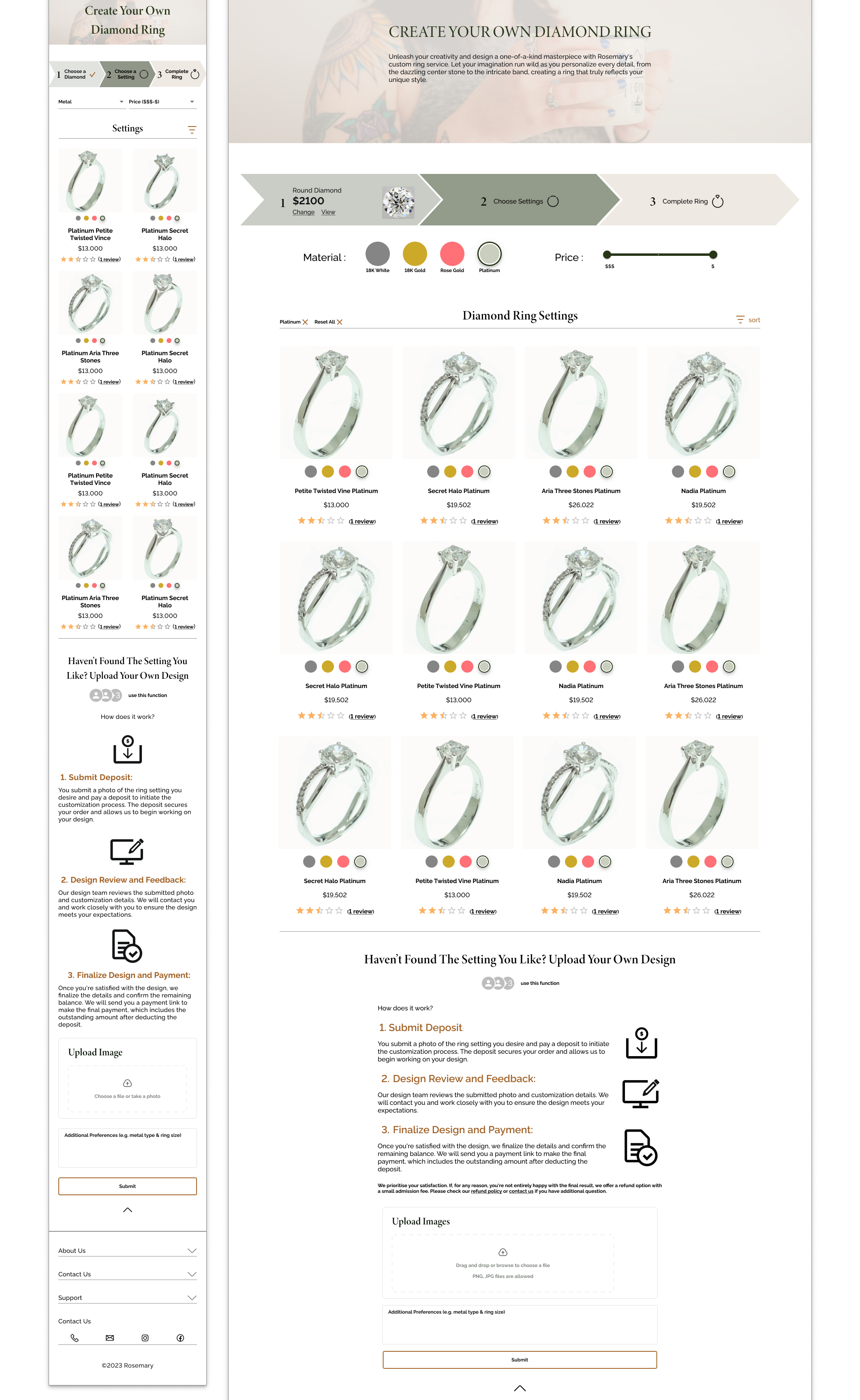
2. Custom Your Ring
Empower users to personalize their jewelry by selecting ring setting, diamond, and engraving. A user-friendly stepper guides them through the process, resulting in a unique piece tailored to their preferences, reflecting Rosemary’s commitment to individuality and innovation.
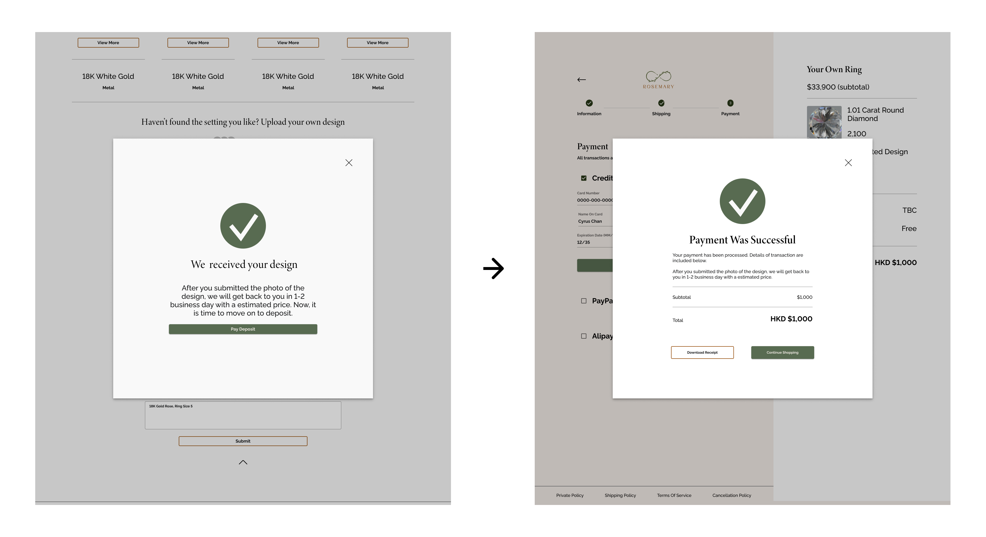
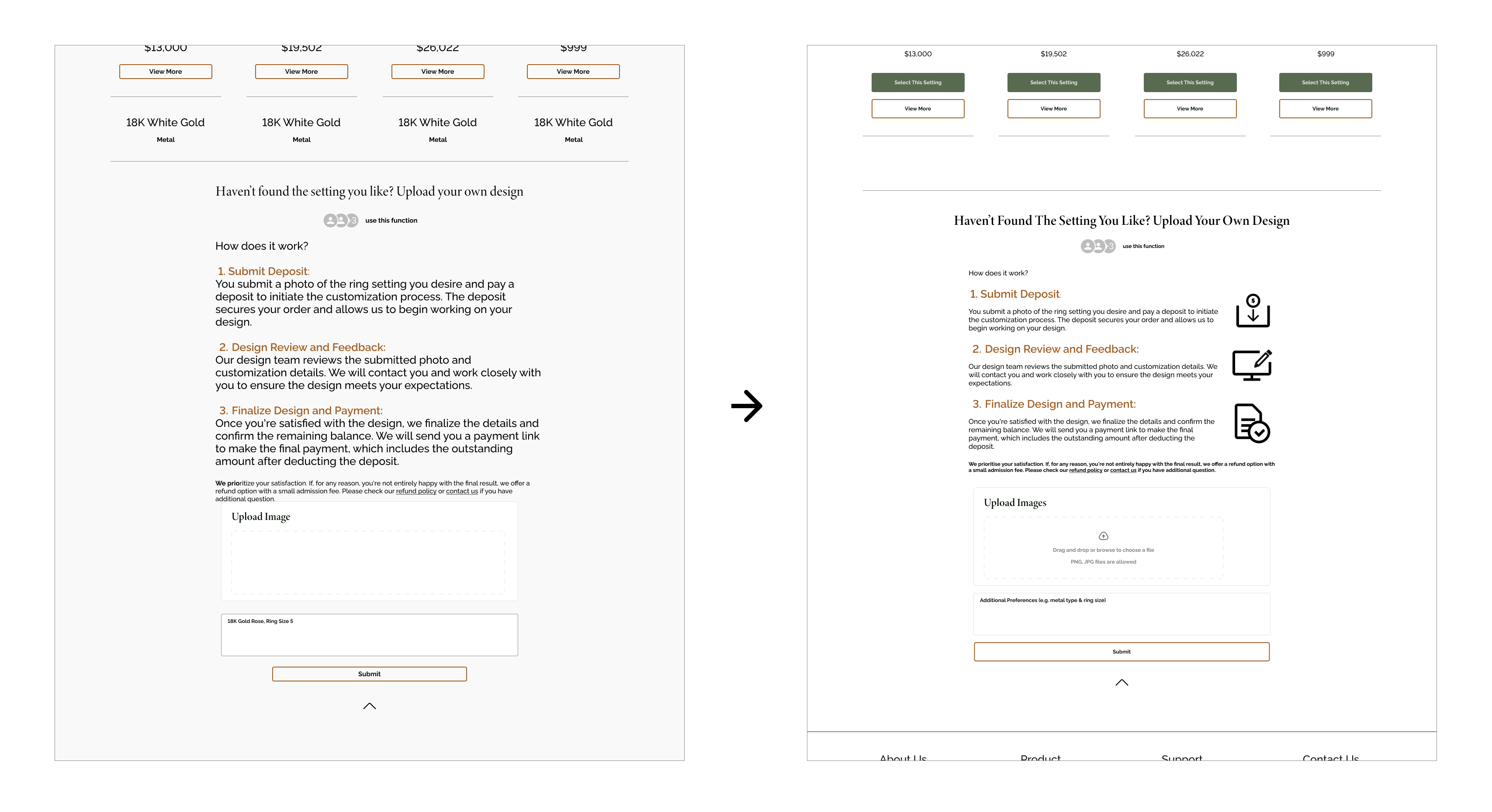
3. Add Own Design
Enable users to submit their custom design sketches or ideas for a bespoke piece. This feature emphasizes Rosemary’s dedication to creativity and collaboration, as skilled artisans bring customers’ visions to life, turning concepts into tangible, one-of-a-kind jewelry creations.
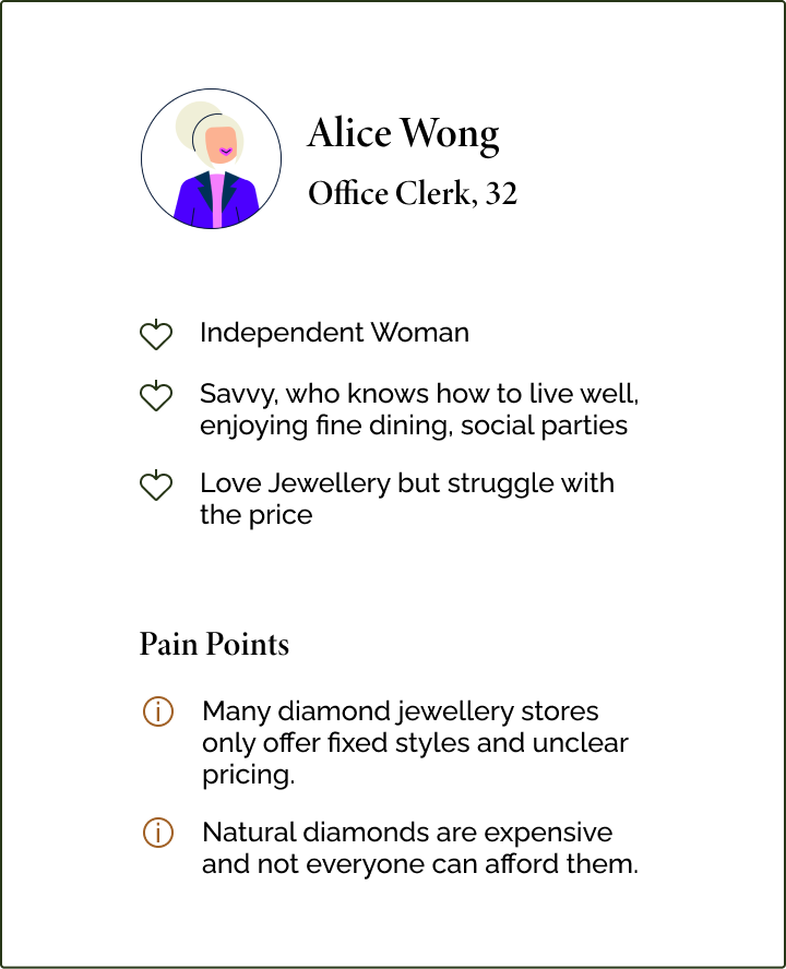
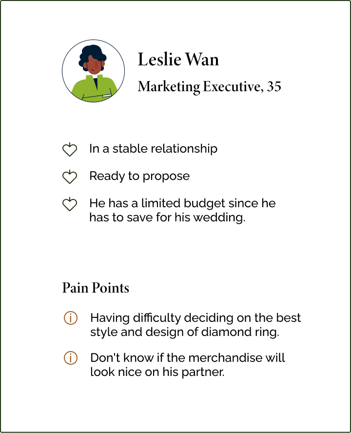
Research
User Interviews:
I conducted 1-on-1 interviews with 6 targeted users of this project and asked them questions about their experiences with E-commerce websites and uncover their goals, needs, motivations and frustrations.
Insights

Try On & Brand Reputation
Trying on products and the brand’s reputation contribute significantly to building trust in a purchase decision.

Product Certificate
For luxurious items, users seek a combination of a lifetime warranty and a product certificate to ensure product quality and authenticity.

Reviews & Decision-Making Process
Reviews hold a paramount influence, accounting for around 90% of the decision-making process.

More Images = More Trust
Users feel more confident about product quality when multiple images (around 6) are available, as the quantity of images often reflects the seller’s confidence in the product.

Budget Consideration
Users generally prefer to see the actual product before making a purchase decision, and budget consideration follows the assessment of style, design, and quality.