Team
Individual Project
• Research
• UI/UX Design
Duration
3 weeks
Tools
Figma, Adobe Illustrator
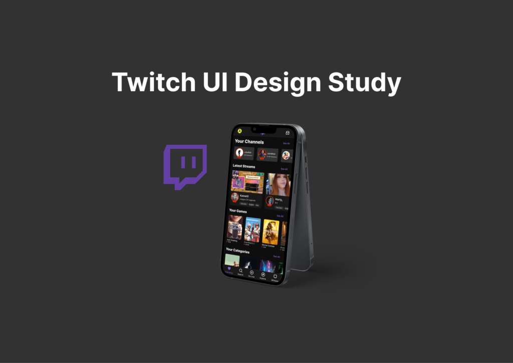
What is Twitch?
Twitch is a live-streaming platform for games, creative content, entertainment, sports etc. Besides, Twitch offers different functions, including chat and sponsored subscriptions to foster interaction between streamers and audiences.
Why Twitch?
According to my qualitative research, many user reviews claim that the Twitch app has no discoverability. By discoverability, I mean how users can discover new streamer channels and games they might enjoy. Hence, I see an opportunity to combine entertainment and discoverability on this platform. Especially on the mobile view, the layout is different from the web and it confuses the users. Because of these reasons, I try to explore some possibilities for the user interface.
Project
Overview
The core intention of the redesign is to increase the discoverability of Twitch. So the whole project is developed surrounding 3 aspects:
1. Navigation: with both a navigation bar and a smoother use-flow. I get inspired by other streaming and media platform, such as Youtube and Twitter. -> attract new streamers and engage old users.
2. Search: user can get a more vivid exploration experience by providing visual hints. -> users can discover more channels and games.
3. Page Sections: offer videos and streams update. Users can closely follow streamers news and hence stay engaged with the channel. -> encourage users to follow and subscribe to streamers.
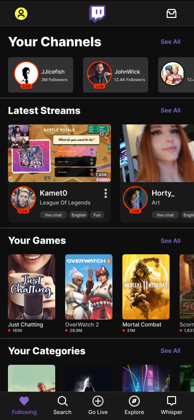
Comparison – Following
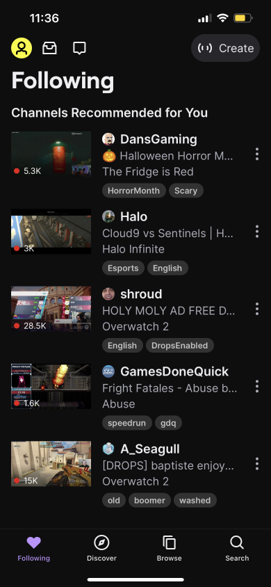
Goal: To differentiate the navigation and content.
Suggestion: Lighten the background colour of the header and navigation bar to differentiate the content.
Goal: To highlight the most crucial information for a better browsing process.
Suggestion: Place the following channels at the top instead of the bottom. The card will show channels’ avatars, names, followers, and live status.
Goal: To foster users’ interaction with the streamer status information.
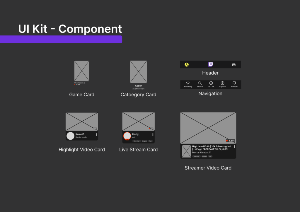
Suggestion: Use card components to demonstrate separated streams. In the revised version, the streamer’s avatar got enlarged and displayed “live” status so users can easily grab the status information.
Goal: Consistent interaction control.
Suggestion: Adapt horizontal scrolling to show more sections on the following page. Users have the option to press “see all” for further details.
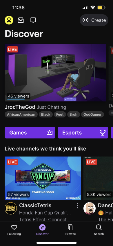
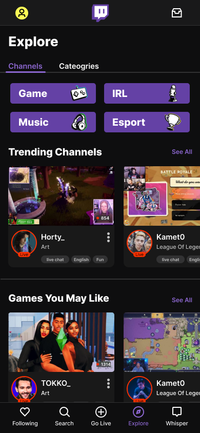
Comparison – Explore Channels
Goal: To maintain users’ mental model and the usability of Twitch.
Suggestion: Browse section is not available on the webpage of Twitch, it would be good to combine them with tabs as they are similar things.
Goal: In the web version, Twitch is using illustrations for games, esports, and other categories. To keep the consistency, I followed suit instead of using flat icons.
Goal: To increase the discoverability of the application.
Suggestion: A new section of “Trending Channels” is in the new layout.
Goal: To keep visual consistency throughout Twitch.
Suggestion: The same video components are used again, hence it avoids confusion from different video layouts.
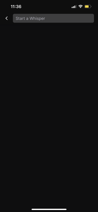
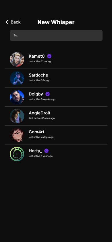
Comparison – Whisper
Goal: To provide a visual hint to initiate the conversation.
Suggestion:
•Whisper is like the message function, but there seems to be a lack of guidance from the original version.
•First, I added a page title to show users where they are. Second, the back icon and text are presented together for accessibility concerns.
•Default options to help users get started and have a shortcut. (e.g. it will display the most frequent search and close contact)
Comparison – Search
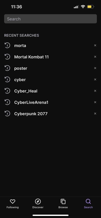
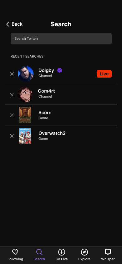
Goal: To improve an alternative visual solution.
Suggestion: I add a page title to show users where they are. Second, the back icon and text are presented together for usability considerations.
Goal: To provide pre-viewed information about the search result.
Suggestion: The major difference is that search results will be categorised. (e.g.game or channel) Besides, images of the content will be shown together for a better user experience.
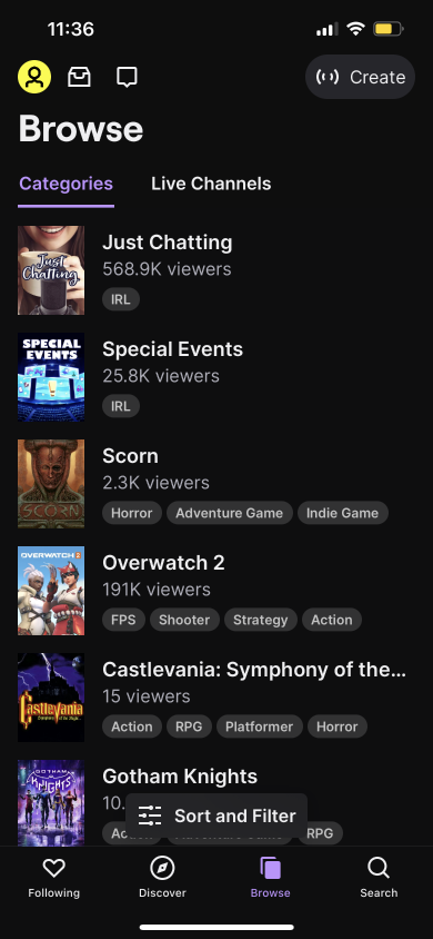
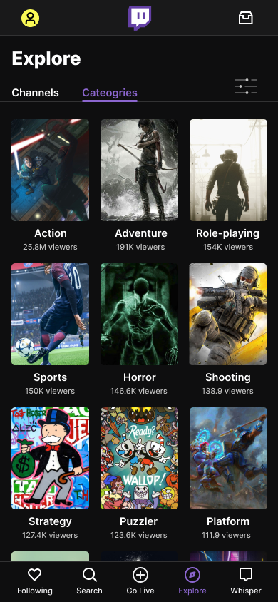
Comparison – Explore Categories
Goal: To clarify terminology and increase discoverability.
Suggestion:
• By conventional meaning, Twitch should not use games to represent categories as they are different terms and thus may cause confusion to the users. The category makes more sense by sorting the games into action, shooting, sports etc.
• A filter has been applied on the top right-hand concern so the users can search their category by view count, trending, rating etc. Consider that as a new way to explore new games.
• Three grid layout has been applied to this page as it can show more information about real estate without scrolling a lot.

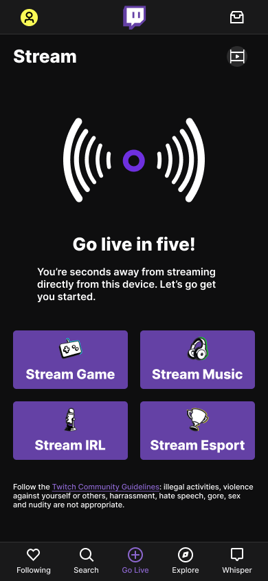
Comparison – Stream1
Goal: To focus on the main primary CTA.
Suggestion: Reorganise the header and the navigation bar. The platform is to advocate content creation, hence primary CTA – “Go live” should be placed in the middle.
Goal: To keep the web and mobile versions consistent.
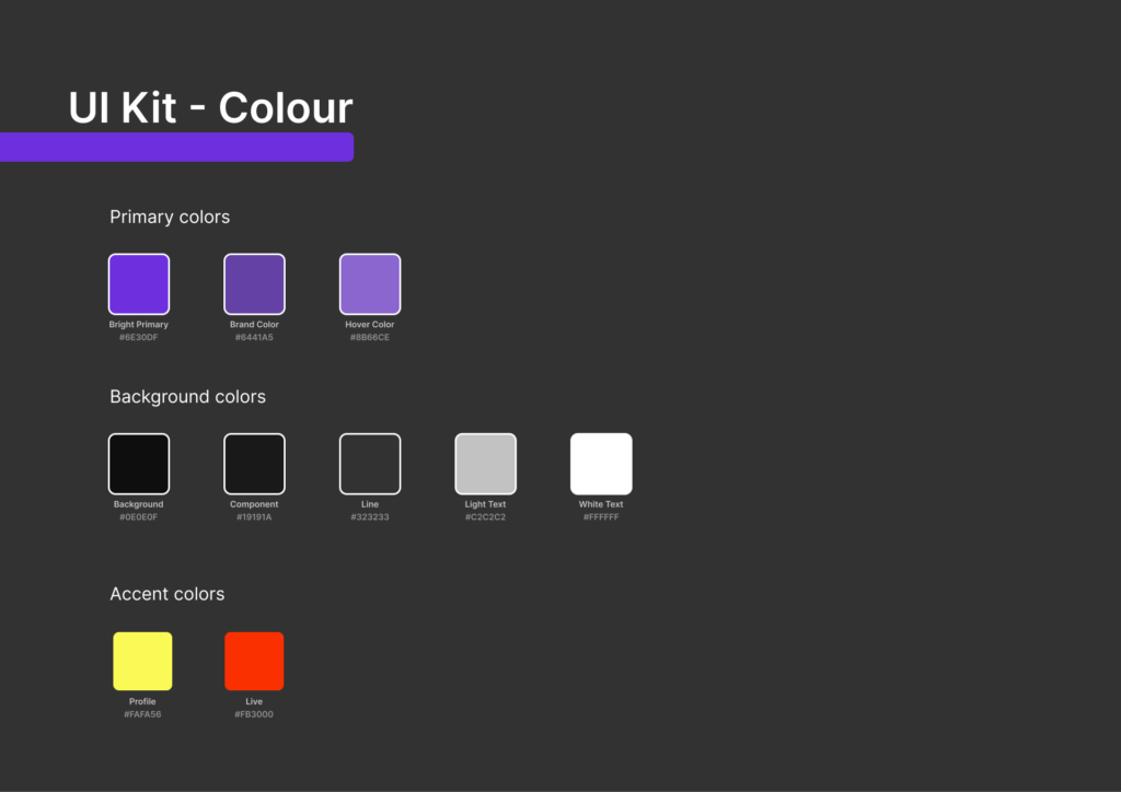
Suggestion: Illustrations of games, music, IRL, and Esport are used to foster better communication. Besides, primary colours should be used on these buttons as they are CTAs.
Goal: To offer an alternative approach on a user-friendly interface
Suggestion:
• Icon-like illustration (Go live) is used for a more approachable understanding.
• Keep the same navigation bar to maintain the same mental model, users can still access content and home through the icon from the right-hand concern.
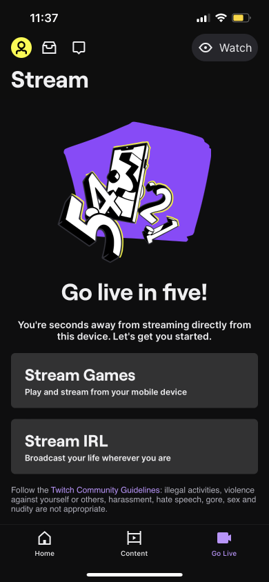
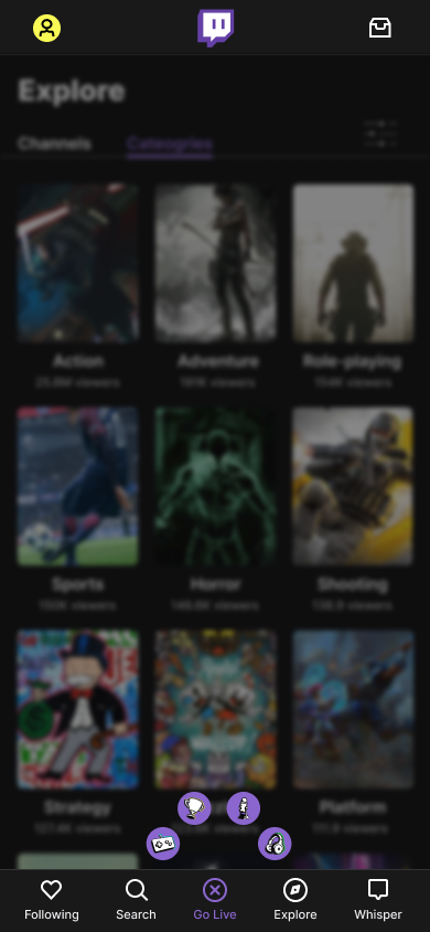
Comparison – Stream2
Goal: Another press option to reduce the amount of interface on the screen. So users can perform the “Go Live” function even when they are on the other screens.
Suggestion:
• Press a button for more than a second, or hard press the button to get more options.
• For iPhone users, hard press the screen brightness slider for example. Many more options appear.
• Apply layer blur to engage users on the task.
Comparison – Game
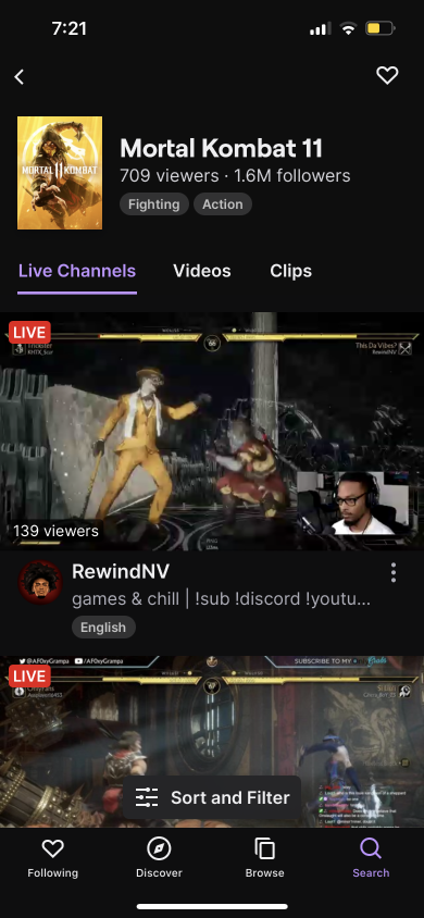
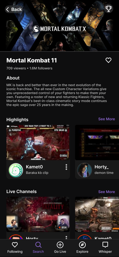
Goal: To adopt fresh UI elements
Suggestion: A banner is applied on the game introduction page instead of the thumbnail (as the user already saw the thumbnail in the search result). A grey transparent background is used on the icon in case the contrast was low in comparison with the banner image.
Goal: To maintain user’s mental model.
Suggestion: A “like” button has always been placed with the title side by side so the users always know where to like a channel or category.
Goal: To boost engagement with Esport section.
Suggestion: A “Esport” button is on top of the right-hand side if there is a game that is having a competition so users can easily navigate themselves.
Goal: To introduce a game fully to the users.
Suggestion: A game overview can help users understand what the game is about. The game’s highlights are displayed at the top of the page. It can undeniably engaged users.
Comparison – Streamer
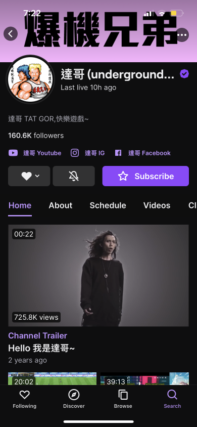
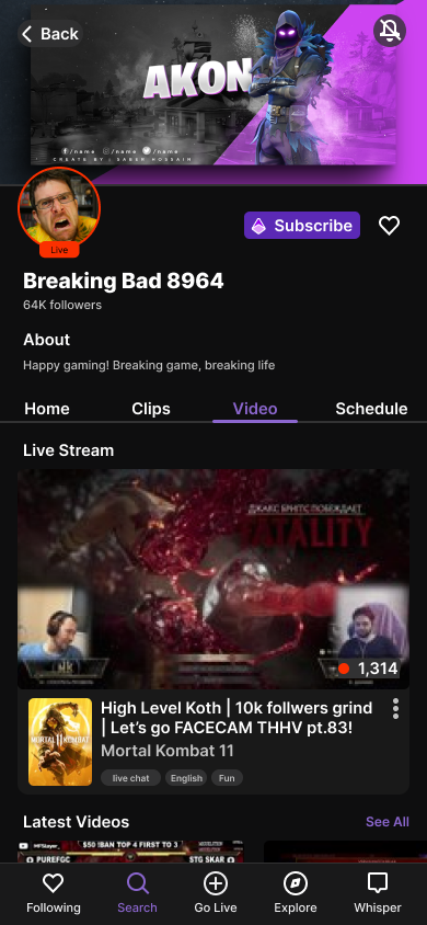
Goal: To create a new layout is neat and consistent with other pages of the platform.
Suggestion: Keep the layout intact but made some changes to the buttons.
Goal: To deliver a better visual message with payment.
Suggestion: As a Twitch user, people know you need to pay for subscription and icon Bits will create a stronger association with payment. As it is how audiences sponsor the streamer.
